Mockup Design for my Novel (in progress)

Talk about anything in here.

Mockup Design for my Novel (in progress)

Postby Warrior 4 Jesus » Sat Aug 13, 2005 1:56 am

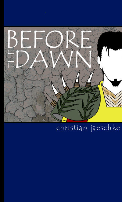
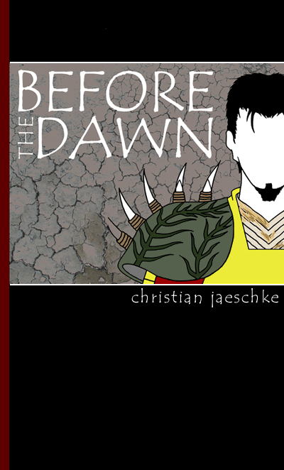
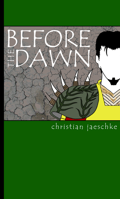
This is possibly one of my final designs for my novel, Before the Dawn discussed in the Warrior 4 Jesus Art thread (art corner).
It's still a work in progress. I have to give Dexiz (the guy on the front) a face, make armour spikes shorter so they don't impale him and clean up some of the line work.

Image

Comments or criticisms?
User avatar
Warrior 4 Jesus
 
Posts: 4844
Joined: Tue Sep 07, 2004 10:52 pm
Location: The driest continent that isn't Antarctica.

Postby Sammy Boy » Sat Aug 13, 2005 8:46 am

Hello, just wondering what kind of novel it will be? If it's going to be a gritty read with a lot of grim fight battle scenes, it may help to make the cover look a bit "darker" in the sense of the colours used (black, brown, grey) and use another font instead of the current one (maybe gothic fonts or similar).

Just an idea. Cheers. :)
User avatar
Sammy Boy
 
Posts: 1410
Joined: Wed May 25, 2005 7:04 am
Location: Autobase, Cybertron

Postby Yumie » Sat Aug 13, 2005 8:51 am

Cool, it looks good to me!
User avatar
Yumie
 
Posts: 1939
Joined: Sat Apr 09, 2005 12:00 pm
Location: In a house

Postby Esoteric » Sat Aug 13, 2005 8:57 am

Hey, I very much like the breakup of elements...(green at top, picture, larger green at bottom. Over all, it's a good layout. I'm wondering if more text or perhaps a small design is going to go in the lower green portion. If not, it will seem a bit, bare.
Until the picture is a bit more finished, it's hard to critique. Use of the crackled earth pic in the background is effective. Depending on what sort of effect you want, you could add a drop shadow behind Dexiz so that he would 'pop' out from the 'wall' more. But that's only if you want more depth. Again it all depends on the feel you want.
User avatar
Esoteric
 
Posts: 1603
Joined: Sun Aug 22, 2004 1:12 pm
Location: The Lost Room.

Postby That Dude » Sat Aug 13, 2005 1:22 pm

You might want to add a little more color to Dexiz. Like darkening him some. I think that it'd add a nice effect. But it's up to you.
Image
I am convinced that many men who preach the gospel and love the Lord are really misunderstood. People make a “profession,â€
User avatar
That Dude
 
Posts: 5226
Joined: Sat Oct 04, 2003 4:00 am
Location: Where I can see mountains.

Postby Warrior 4 Jesus » Sat Aug 13, 2005 6:38 pm

Ultra Magnus, its a fairly dark fantasy/sci-fi novel with one or two battle scenes but its much more than that. I agree with changing the green to something a little more grim, but I don't think I'm going to change the font. I really like it and think its appropriate for the cover.

Yumie, thanks!

Eosteric, I agree with the drop shadow, sounds like a good idea. As for the amount of space at the bottom I thought it was a good idea in terms of design to allow some 'breathing' space. I will probably only have a 'fake' publishing company logo at the bottom corner (W4J or something like that).

That Dude, I'm not that good at colour detail but it sounds like a good idea and I'll probably try it.

Thanks everyone!
User avatar
Warrior 4 Jesus
 
Posts: 4844
Joined: Tue Sep 07, 2004 10:52 pm
Location: The driest continent that isn't Antarctica.

Postby Godly Paladin » Sat Aug 13, 2005 6:47 pm

Wow! You did that? I'm quite impressed.

I'd definitely cut down on the size of the spikes, and change the green to black or a darker green.
ImageImage
User avatar
Godly Paladin
 
Posts: 2016
Joined: Sun May 23, 2004 10:21 am
Location: Missouri

Postby faithfighter » Sat Aug 13, 2005 6:54 pm

that is sooooooooooooooooo awesome!!!
[color="Green"][font="Verdana"]There is no one you can't love once you know their story-Mary Lou Lawnacki[/font][/color]
User avatar
faithfighter
 
Posts: 806
Joined: Thu Feb 17, 2005 9:05 pm
Location: rattling the cages

Postby Warrior 4 Jesus » Sat Aug 13, 2005 7:03 pm

Thanks Godly Paladin!

Yeah, I'm going to cut down the spikes. Which of these is the better colour scheme?
I like the black one best.

Image

Image
User avatar
Warrior 4 Jesus
 
Posts: 4844
Joined: Tue Sep 07, 2004 10:52 pm
Location: The driest continent that isn't Antarctica.

Postby Godly Paladin » Sat Aug 13, 2005 7:06 pm

I think the black one matches the sidebar color better, but just as a color I think I prefer blue.
ImageImage
User avatar
Godly Paladin
 
Posts: 2016
Joined: Sun May 23, 2004 10:21 am
Location: Missouri

Postby faithfighter » Sat Aug 13, 2005 7:06 pm

I like the blue!!!
[color="Green"][font="Verdana"]There is no one you can't love once you know their story-Mary Lou Lawnacki[/font][/color]
User avatar
faithfighter
 
Posts: 806
Joined: Thu Feb 17, 2005 9:05 pm
Location: rattling the cages

Postby Warrior 4 Jesus » Sat Aug 13, 2005 7:10 pm

Thanks guys! I don't know what to go with. I like the black one, but everyone else (2 people (lol) like the blue one better. I can't win. Argh!!!
User avatar
Warrior 4 Jesus
 
Posts: 4844
Joined: Tue Sep 07, 2004 10:52 pm
Location: The driest continent that isn't Antarctica.

Postby ShiroiHikari » Sat Aug 13, 2005 7:13 pm

I think the black one looks a lot classier.
fightin' in the eighties
User avatar
ShiroiHikari
 
Posts: 7564
Joined: Wed May 28, 2003 12:00 pm
Location: Somewhere between 1983 and 1989

Postby Warrior 4 Jesus » Sat Aug 13, 2005 7:21 pm

Thanks ShiroiHikari, I like the black one best because of that also. I've never designed a book cover before - its a bit daunting but fun! Do you have any suggestions? Do I need to add a publishing house (fake) name at the bottom or not? Some people say its empty, I say it has 'breathing' space. (lol)

Thanks!
User avatar
Warrior 4 Jesus
 
Posts: 4844
Joined: Tue Sep 07, 2004 10:52 pm
Location: The driest continent that isn't Antarctica.

Postby ShiroiHikari » Sat Aug 13, 2005 7:24 pm

The layout itself looks pretty good to me; it's not too busy. :]
fightin' in the eighties
User avatar
ShiroiHikari
 
Posts: 7564
Joined: Wed May 28, 2003 12:00 pm
Location: Somewhere between 1983 and 1989

Postby Rachel » Sat Aug 13, 2005 9:38 pm

That's really cool! I kinda like the black one better.
:rock: I mourn for those who never knew you


Click here for kick booty music!!

American by birth, Texan by the grace of God


This is where you can find me if I'm not on for a while
User avatar
Rachel
 
Posts: 1056
Joined: Tue Nov 18, 2003 10:00 am
Location: Wichita Falls, Texas

Postby soul alive » Sat Aug 13, 2005 10:12 pm

i like the black one. maybe try a bit of a compromise and do a very subtle gradient from black to dark blue, the black being on the upper and lower edges, fading toward the picture; just a thought.
-Sara-

[SIGPIC][/SIGPIC]

A Cruce Salus, a webmanga. --- Status: Undergoing rewrites, currently offline

soul-alive.deviantart.com

"People say I'm strange, does it make me a stranger / That my best friend was born in a manger?" 'Jesus Freak' - dc Talk
User avatar
soul alive
 
Posts: 1523
Joined: Fri Jul 16, 2004 4:53 pm
Location: way out west

Postby Sammy Boy » Sun Aug 14, 2005 1:58 am

Black is gooooooooood. :)
User avatar
Sammy Boy
 
Posts: 1410
Joined: Wed May 25, 2005 7:04 am
Location: Autobase, Cybertron

Postby CreatureArt » Sun Aug 14, 2005 3:00 am

The black is nice. I particularly like the white bars separating the main picture from the background - perhaps that is one of the reasons it looks classier. The sidebar, like someone else said, goes well with the colour scheme too. Very nice. It's a great piece of work.
---
[SIGPIC][/SIGPIC]
A sci-fi drama webcomic updating Thursdays.
PG-13. Rating description here.
---
User avatar
CreatureArt
 
Posts: 1107
Joined: Sun Oct 24, 2004 12:11 pm
Location: Studentville, New Zealand

Postby Warrior 4 Jesus » Sun Aug 14, 2005 5:55 am

Cheers everyone!
Soul Alive, I'll give that a go tomorrow but I'm too tired at the moment. Thanks!
User avatar
Warrior 4 Jesus
 
Posts: 4844
Joined: Tue Sep 07, 2004 10:52 pm
Location: The driest continent that isn't Antarctica.

Postby Mave » Sun Aug 14, 2005 1:52 pm

I like the black version better. Nice job, W4J! :thumb:
User avatar
Mave
 
Posts: 3662
Joined: Tue Aug 12, 2003 9:00 am

Postby Godly Paladin » Tue Aug 16, 2005 1:12 pm

I could never do that... Kudos kudos kudos.
ImageImage
User avatar
Godly Paladin
 
Posts: 2016
Joined: Sun May 23, 2004 10:21 am
Location: Missouri

Postby Zane » Wed Aug 17, 2005 7:52 pm

How'd I miss this thread Tin? I assume now that you're doing the cover design you're finished with the writting itself, or just taking a breather?

And are you going to go to some small-time publishers in SA or send it nation-wide to NSW or something? And since its a christian novel do you reckon secular publishers will pick it up or will you only have a chance with christian publishers? Have you thought about that?

Go with the black btw.
User avatar
Zane
 
Posts: 498
Joined: Sun Jun 13, 2004 9:55 pm

Postby Alice » Wed Aug 17, 2005 8:13 pm

Sweet meat! Did you finish writing the story? :D
People talking without speaking
People hearing without listening
People writing songs that voices never share

And no one dared
Disturb the sound of silence.
User avatar
Alice
 
Posts: 1707
Joined: Thu Apr 14, 2005 8:58 pm
Location: Scarborough Fair

Postby bigsleepj » Thu Aug 18, 2005 12:15 am

Zane wrote:And are you going to go to some small-time publishers in SA ...

Do you mean South Australia? For a moment I thought you meant South Africa. Doh!

On topic - All those covers look good to me - but the last / black one looks the best to me. :grin:
Unwise Toasting Sermon

The Sweet Smell of CAA
The Avatar Christian Ronin designed for me
An Avatar KhakiBlue gave to me
The avatar Termyt made for me

KhakiBlueSocks wrote:"I'm going to make you a prayer request you can't refuse..." Cue the violins. :lol:

Current Avatar by SirThinks2much - thank you very much! :thumb::)
User avatar
bigsleepj
 
Posts: 3432
Joined: Sun Apr 11, 2004 12:00 pm
Location: South Africa - Oh yes, better believe it!

Postby Warrior 4 Jesus » Thu Aug 18, 2005 1:32 am

Zane! Good to hear from you mate!

Zane, Alice and Everyone:

No, sorry. I'm nowhere near finished. I'm trying to spruce up my writing skills first. I have 16 typed pages of notes. The longest story I've written is 16,000 words. (Long stories don't come to me easily (not just because of my dyslexia), but I hope to get 60,000 words for this novel, or whatever it takes to tell the story best). I'm beginning the proper rough draft soon, but since I've planned better beforehand, hopefully the novel will be of a higher quality). So yes, you could say I was taking a breather.

I want to just get it published full-stop. That's pretty hard actually. It would be great to be done by small publishers in SA, but I really would like to send it nation-wide and maybe sell e-book versions to download for those non-Australians.

Its a Christian novel in the sense that its written by a Christian (in more ways then one) lol. A Christian world-view is taken and questions of faith and Christian themes are discussed etc but I want it to be fairly subtle. If I want to find out stuff about Jesus I read the Bible. The first thing I want is the novel to be entertaining. I don't like reading Christian books that read like sermons. Then the second thing is I want the reader to question and I want to use the book as a tool to plant a seed, a thought or something directing towards the Truth: Jesus without bashing people over the head with faith. I respect and admire authors like Frank Peretti and Ted Dekker. Hopefully I can get both secular and Christian markets but I think a lot of praying will need to be involved.

Thanks bigsleepj and everyone for your kind comments! I hope this info helps you understand a bit better.
God Bless!
User avatar
Warrior 4 Jesus
 
Posts: 4844
Joined: Tue Sep 07, 2004 10:52 pm
Location: The driest continent that isn't Antarctica.

Postby Naga Kisaki » Thu Aug 18, 2005 2:12 pm

Very neat. The cover's intriguing and seems to promise a good read. I like the purple cover, becuase it betercatches the eye, but thats just my opinion.
Image

Oh, You'd better be afraid, Darkalicious bishonen villans! Your mine!
User avatar
Naga Kisaki
 
Posts: 101
Joined: Mon Aug 01, 2005 2:52 pm
Location: Naga Lohka

Postby Alice » Thu Aug 18, 2005 2:35 pm

Sounds really good. :thumb: : )
People talking without speaking
People hearing without listening
People writing songs that voices never share

And no one dared
Disturb the sound of silence.
User avatar
Alice
 
Posts: 1707
Joined: Thu Apr 14, 2005 8:58 pm
Location: Scarborough Fair

Postby yukinon » Thu Aug 18, 2005 2:40 pm

Honestly, I like the green version best. It's an appealing color and would make me randomly pick the book up off the shelf and say "hmmm....what ees thees?" Seriously, it would. And I actually think it would be a neat effect to leave the guy faceless. That also grabs my attention and intrigues me.

Hooray for the unconventional!

And as cool as the armor spikes are, they definitely need some trimming. :sweat:
9&&|(=|()v&
User avatar
yukinon
 
Posts: 652
Joined: Wed May 04, 2005 1:06 pm
Location: with a diva rabbit

Postby Warrior 4 Jesus » Thu Aug 18, 2005 3:01 pm

Thankyou! Actually that's not a bad idea to keep him faceless! I'll have to keep that in mind (may do it). Thanks!
User avatar
Warrior 4 Jesus
 
Posts: 4844
Joined: Tue Sep 07, 2004 10:52 pm
Location: The driest continent that isn't Antarctica.

Next

Return to General

Who is online

Users browsing this forum: No registered users and 169 guests