
So I was just reading this article on Yahoo news, and was wondering if any of you guys had heard of this, and what you think about it. Apparently if you turn your head sideways, cross your eyes and read the logo upside down, it spells Zion, so Iran is now going to boycott the 2012 Olympic games. All I can say is "Wut? Are these people serious?"
On a side note, I think we should boycott it on bad design. As much as it doesn't look like it says zion, it doesn't really look like 2012 either.
Racist Olympic logo?
40 posts •
Page 1 of 2 •
- 1
- 2
-

Edward - Posts: 433
- Joined: Sat Oct 09, 2010 1:23 pm
- Location: Neither here nor there


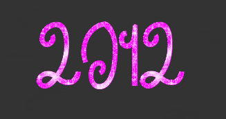
It's a terrible logo in the first place, but it just says 2012. I can't even see how you can bend it around to say zion in the first place without zigzagging all over the place.

-

mechana2015 - Posts: 5025
- Joined: Wed Oct 22, 2003 12:33 am
- Location: Orange County
Wow, logo fail...
Canada's design was MUCH better! (then again, I'm biased)
Mech, if you read it from top to bottom then go right from there, it very vaguely represents it, I can see how people thought that.
Canada's design was MUCH better! (then again, I'm biased)
Mech, if you read it from top to bottom then go right from there, it very vaguely represents it, I can see how people thought that.
And this I pray, that your love would abound still, more and more with real knowledge and all discernment. Be prepared to preach the gospel at a moment's notice. Do you know the gospel well enough to do so yourself? Be ready.
-

Furen - Posts: 2695
- Joined: Mon Jul 26, 2010 9:39 pm
- Location: Mostly at my PC, but meh, I can be wherever.
Furen (post: 1462487) wrote:Canada's design was MUCH better! (then again, I'm biased)
Actually just about ANY design is better than the London logo. That thing is pure eye searing graphic design failure on all levels.
-
mechana2015 - Posts: 5025
- Joined: Wed Oct 22, 2003 12:33 am
- Location: Orange County
-

Warrior 4 Jesus - Posts: 4844
- Joined: Tue Sep 07, 2004 10:52 pm
- Location: The driest continent that isn't Antarctica.
A testament to bad design: I didn't even realize it was supposed to say "2012" until someone said something about that in this thread. XDD
[color="DeepSkyBlue"]4 8 15 16 23[/color] 42
[color="PaleGreen"]Rushia: YOU ARE MY FAVORITE IGNORANT AMERICAN OF IRISH DECENT. I LOVE YOU AND YOUR POTATOES.[/color]
[color="Orange"]WELCOME TO MOES[/color]

-

Radical Dreamer - Posts: 7950
- Joined: Sat May 28, 2005 9:00 am
- Location: Some place where I can think up witty things to say under the "Location" category.
-
mechana2015 - Posts: 5025
- Joined: Wed Oct 22, 2003 12:33 am
- Location: Orange County
mechana2015 (post: 1462493) wrote:A font of combined comic sans and papyrus would be easier to read.
I definitley made the worst "BLECH" face ever when I read that font description...
Who was the graphic designer behind that and what was going through their head!? Also, why are the Ohio State fans mad? Just because no Ohio sports teams can win anything does not mean we should go getting mad about stuff. Why would anyone put the name of an Ohio State player in the Olympic logo, anyway?
C'mon, our state is not that important.
~My Website~
[color="Cyan"]"Have you ever gotten the urge to do something crazy... and AWESOME!?" -Demyx[/color]
[color="Cyan"]"Have you ever gotten the urge to do something crazy... and AWESOME!?" -Demyx[/color]
-

Asuka Neko - Posts: 114
- Joined: Fri Mar 26, 2010 1:56 pm
- Location: The State of Mind that Never Was


Radical Dreamer (post: 1462492) wrote:A testament to bad design: I didn't even realize it was supposed to say "2012" until someone said something about that in this thread. XDD
seconded
And this I pray, that your love would abound still, more and more with real knowledge and all discernment. Be prepared to preach the gospel at a moment's notice. Do you know the gospel well enough to do so yourself? Be ready.
-
Furen - Posts: 2695
- Joined: Mon Jul 26, 2010 9:39 pm
- Location: Mostly at my PC, but meh, I can be wherever.
I know this poor logo has already been beaten to death multiple times, but my honest thoughts when I first saw it were "Wow! What year is it? 1992?"
Anyways, back to the point, that logo isn't racist it just sucks.
Anyways, back to the point, that logo isn't racist it just sucks.
-

sailorsaturn - Posts: 53
- Joined: Tue Jul 06, 2010 1:45 pm
- Location: Livin in the ocean
mechana2015 (post: 1462493) wrote:A font of combined comic sans and papyrus would be easier to read.
[SIZE="6"][font="Papyrus"][color="Magenta"]You[/font][/color] [font="Curlz MT"][color="Yellow"]r[/font][font="Comic Sans MS"]ea[/font][font="Papyrus"]lly[/font][/color] [color="Magenta"][font="Comic Sans MS"]think[/font][/color] [font="Curlz MT"][color="Cyan"]so?[/color][/font][/SIZE]
Oh my gosh you guys I am forever sorry for this post. [font="Garamond"]Here's some Garamond to make it better.[/font] XD
[color="DeepSkyBlue"]4 8 15 16 23[/color] 42
[color="PaleGreen"]Rushia: YOU ARE MY FAVORITE IGNORANT AMERICAN OF IRISH DECENT. I LOVE YOU AND YOUR POTATOES.[/color]
[color="Orange"]WELCOME TO MOES[/color]
-
Radical Dreamer - Posts: 7950
- Joined: Sat May 28, 2005 9:00 am
- Location: Some place where I can think up witty things to say under the "Location" category.
Radical Dreamer (post: 1462508) wrote:[SIZE="6"][font="Papyrus"][color="Magenta"]You[/font][/color] [font="Curlz MT"][color="Yellow"]r[/font][font="Comic Sans MS"]ea[/font][font="Papyrus"]lly[/font][/color] [color="Magenta"][font="Comic Sans MS"]think[/font][/color] [font="Curlz MT"][color="Cyan"]so?[/color][/font][/SIZE]

-

blkmage - Posts: 4529
- Joined: Mon May 03, 2004 5:40 pm
Actually, it is easier to read. You are officially a better graphic designer than whoever did the London logo.

-

Yuki-Anne - Posts: 1637
- Joined: Thu Aug 10, 2006 10:33 am
- Location: Japan
Yuki-Anne (post: 1462511) wrote:Actually, it is easier to read. You are officially a better graphic designer than whoever did the London logo.
Excuse me while I go cry intensely for DAYS. XDD I just wrote a small rant today about how Curlz MT is making my life so terrible. XDD
[color="DeepSkyBlue"]4 8 15 16 23[/color] 42
[color="PaleGreen"]Rushia: YOU ARE MY FAVORITE IGNORANT AMERICAN OF IRISH DECENT. I LOVE YOU AND YOUR POTATOES.[/color]
[color="Orange"]WELCOME TO MOES[/color]
-
Radical Dreamer - Posts: 7950
- Joined: Sat May 28, 2005 9:00 am
- Location: Some place where I can think up witty things to say under the "Location" category.
mechana2015 (post: 1462488) wrote:Actually just about ANY design is better than the London logo. That thing is pure eye searing graphic design failure on all levels.
I designed a better logo.
[font="Tahoma"][SIZE="2"]"It was so much easier to blame it on Them. It was bleakly depressing to think that They were Us. If it was Them, then nothing was anyone's fault. If it was us, what did that make Me? After all, I'm one of Us. I must be. I've certainly never thought of myself as one of Them. No one ever thinks of themselves as one of Them. We're always one of Us. It's Them that do the bad things."
-Terry Pratchett[/SIZE][/font]
-Terry Pratchett[/SIZE][/font]
-

Cognitive Gear - Posts: 2381
- Joined: Sun Jan 09, 2005 9:00 am
Radical Dreamer (post: 1462508) wrote:[SIZE="6"][font="Papyrus"][color="Magenta"]You[/font][/color] [font="Curlz MT"][color="Yellow"]r[/font][font="Comic Sans MS"]ea[/font][font="Papyrus"]lly[/font][/color] [color="Magenta"][font="Comic Sans MS"]think[/font][/color] [font="Curlz MT"][color="Cyan"]so?[/color][/font][/SIZE]
Oh my gosh you guys I am forever sorry for this post. [font="Garamond"]Here's some Garamond to make it better.[/font] XD
After seeing that Olympic logo, I am having a hard time finding this offensive. It just pales in comparison.
Where an Eidolon, named night, on a black throne reigns upright.
-

ich1990 - Posts: 1546
- Joined: Mon Apr 16, 2007 2:01 pm
- Location: The Land of Sona-Nyl
I saw this logo before: someone said it looked like a broken-up swastika. A pink one, too.
Also, the people who designed it apparently got $600,000 for it. Now that's offensive.
Also, the people who designed it apparently got $600,000 for it. Now that's offensive.
We are loved even though we suck.
Psalms 37:37 (NHEB)
Mark the perfect man, and see the upright, for there is a future for the man of peace.
Psalms 37:37 (NHEB)
Mark the perfect man, and see the upright, for there is a future for the man of peace.
-

Davidizer13 - Posts: 1080
- Joined: Fri Jun 26, 2009 9:27 am
- Location: VIOLENT CITY
Cognitive Gear (post: 1462514) wrote:I designed a better logo.
is that a one or a nine?
better than confusing 2012 with zion I guess!
And this I pray, that your love would abound still, more and more with real knowledge and all discernment. Be prepared to preach the gospel at a moment's notice. Do you know the gospel well enough to do so yourself? Be ready.
-
Furen - Posts: 2695
- Joined: Mon Jul 26, 2010 9:39 pm
- Location: Mostly at my PC, but meh, I can be wherever.
Davidizer13 (post: 1462519) wrote:I saw this logo before: someone said it looked like a broken-up swastika. A pink one, too.
Also, the people who designed it apparently got $600,000 for it. Now that's offensive.
World hunger? What's that?
-
Yuki-Anne - Posts: 1637
- Joined: Thu Aug 10, 2006 10:33 am
- Location: Japan
It's when we no longer throw people into Volcanos. XDWorld hunger? What's that?
Proverbs 31:32 "...when she watches anime, she keeps the room well lit and sits at a safe distance."
-

Rusty Claymore - Posts: 1258
- Joined: Sun Jan 03, 2010 2:18 pm
- Location: Alaska
Rusty Claymore (post: 1462525) wrote:It's when we no longer throw people into Volcanos. XD
Awww, darn... *crosses afternoon activities...*
And this I pray, that your love would abound still, more and more with real knowledge and all discernment. Be prepared to preach the gospel at a moment's notice. Do you know the gospel well enough to do so yourself? Be ready.
-
Furen - Posts: 2695
- Joined: Mon Jul 26, 2010 9:39 pm
- Location: Mostly at my PC, but meh, I can be wherever.
I don't know what I find more comical, the idea that they paid $600,000 for that logo or that they were thinking they could get away with only paying $600,000 for a logo for the Olympics. I mean, the event is going to be huge, you want to have the best advertising you possibly can. Otherwise, it just doesn't pay you to host it.
-

Dante - Posts: 1323
- Joined: Thu Mar 04, 2004 8:24 pm
- Location: Where-ever it is, it sure is hot!
I looked at the logo and was all, "ZOR!!!"
Proverbs 31:32 "...when she watches anime, she keeps the room well lit and sits at a safe distance."
-
Rusty Claymore - Posts: 1258
- Joined: Sun Jan 03, 2010 2:18 pm
- Location: Alaska
I'm sorry Iran but you guys are silly for thinking this says "ZION". It's a terrible logo regardless, though.
fightin' in the eighties
-

ShiroiHikari - Posts: 7564
- Joined: Wed May 28, 2003 12:00 pm
- Location: Somewhere between 1983 and 1989
-

Shao Feng-Li - Posts: 5187
- Joined: Sun Oct 12, 2003 12:00 pm
- Location: Idaho
Had I not read the article, I never would have noticed that it looked like Zion (if barely). Still, I can barely see the 2012. Cognitive's 2012 was much clearly...despite that 1 looking like a 9.
"Because the World isn't as cruel as you take it to be." ~ Celty, Durarara!!
Be strong and courageous. Do not be afraid or terrified because of them, for the LORD your God goes with you; he will never leave you nor forsake you."
~Deuteronomy 31:6
--------------------------------------------------------------------------------
We live in a fantasy world, a world of illusion. The great task in life is to find reality. ~ Iris Murdoch
-

Sapphire225 - Posts: 640
- Joined: Tue Aug 08, 2006 8:49 pm
- Location: U.S.A
That was supposed to say 2012? It looked like random puzzle pieces to me.
Whatever the season in life, the RIGHT attitude makes all the difference.
"I will lift up mine eyes unto the hills, from whence cometh my help. My help cometh from the LORD, which made heaven and earth."
Psalm 121:1-2
"Though our paths may have diverged, you must continue to live out your life with all your might; you must never consider your own life to be something insignificant, and you must never forget about the friends whom you loved for as long as you live."
The Third Rule of Fairy Tail
"Mistakes are not shackles that halt one from stepping forward. Rather, they are that which sustain and grow one's heart.
Mavis Vermilion, Fairy Tail
When we hit our lowest point, we are open to the greatest change.
Avatar Aang, The Legend of Korra
-

CrystalChalice - Posts: 286
- Joined: Thu May 13, 2010 6:32 am
40 posts •
Page 1 of 2 •
- 1
- 2
Who is online
Users browsing this forum: No registered users and 343 guests