
The results are in, folks! The winner of this months wall contest is. . . (drum roll please. . .)
KOKORO DAISUKE! Congratulations on a fantastic job, Kodai! Now, as much as I'd like to elaborate here, the announcement right below this one about the chat is extremely important and I don't want to push it off the page (if you haven't read it yet, please do,) so, for more information and to read all the wonderful summaries that our magnificent judge, Myrrhlynn, wrote about every single one of the 20 submissions we had, and to find out who placed second, check out the replies on this page where I'll post them. Plus, I'm sure everyone wants to come in and congratulate our winner! ^_^
March wall contest winner!
12 posts •
Page 1 of 1
March wall contest winner!
Be Thou my Vision, O Lord of my heart;
Naught be all else to me, save that Thou art
Thou my best Thought, by day or by night,
Waking or sleeping, Thy presence my light.
Be Thou my Wisdom, and Thou my true Word;
I ever with Thee and Thou with me, Lord;
Thou my great Father, I Thy true son;
Thou in me dwelling, and I with Thee one.
Be Thou my battle Shield, Sword for the fight;
Be Thou my Dignity, Thou my Delight;
Thou my soul’s Shelter, Thou my high Tower:
Raise Thou me heavenward, O Power of my power.
Riches I heed not, nor man’s empty praise,
Thou mine Inheritance, now and always:
Thou and Thou only, first in my heart,
High King of Heaven, my Treasure Thou art.
High King of Heaven, my victory won,
May I reach Heaven’s joys, O bright Heaven’s Sun!
Heart of my own heart, whatever befall,
Still be my Vision, O Ruler of all.
-

Yumie - Posts: 1939
- Joined: Sat Apr 09, 2005 12:00 pm
- Location: In a house
I really wanted to include this on the front page, but, it would have been way too long and no one would be able to see the chat announcement anymore. But! Better here than nowhere! So, our the contestant who placed second is: Glitch1501! Congratulations to you too, Glitch, for coming really close! Now, here are the summaries that Myrrh wrote out for us. These will be great for anyone who submitted a wall, constructive criticism and praise from someone as excellent at designing as Myrrh will be quite useful for your future designs. So, enjoy!
[quote="Myrrhlynn"]
Shao Feng-Li
Good use of contrast between the white and the black areas. There’s a lot of emotion in this wall which is a good choice for a black and white composition. It is a little strange that the top black border has sharp defined lines while the bottom one is blurred. The pixelness on the white squares in the background bothers me a little though.
Orenji
Lacks a definite focal point. The leaves are very cool (I love that other picture you hid in them) but they demand too much of the attention because they take up too much of the wall. The words were a good choice for the series and the wall in general. The text looks good on top of the leaves, but it gets lost over the lighter gray area. Maybe giving the text a darker outer glow would help them stick out more on the lighter area?
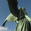
Uriah
Has a lot of good stuff going on. The angel is perfect for a black and white wall! The thick lines and strong screentones make him stick out well, and all those features behind him are wicked cool. The feathers don’t seem to blend so well into the tree leaves though. The text, although it is cool, is too big. (It’s covering up the cool angel!) I think if it were smaller, and maybe more centered on that black space of leaves, it wouldn’t demand so much of the attention.
The Last Bard
Whoa, nice extraction of that image, it’s looks painfully hard to cut out. The character looks good with the grass, and I really like the brushes you used behind the text to make it stand out more. Oh and excellent choice of font! The leaves are a little overpowering though, since they are such extremes in shade. I think the blurry leaves in the very far background work well, but they are getting beaten down by the black and white leaves.
Yumie
The fancy border is an interesting touch, it’s simple and yet not simple at the same time. It really goes well with the picture of the too. The background leaves… something about them bothers me. I think it’s because they are so blurry but the rest of the wall is in such clear focus it makes the leaves look as if they aren’t part of it. I kind of like how the word Tender disappears into the white. It works well on a black and white wall.
Mangafanatic
This wall was poisoned for me because I saw the red colored version first. Argh! The unique arrangement of the image and text sets in apart from other walls in general, and it definitely works well in this case. The large expanse of black is offset strongly by the spotlight and Rue. Unfortunately the image of Rue has some problems with jagged looking edges (looks like it was in the original image that way L ) and it looks like the jaggy disease spread to the words Fairy Tale. The font is cool though, an it fits in well with the series concept.
Esoteric
Very, very cool font and use of the text. Blending in those lines on the top and the bottom was a fantastic idea too. It makes the sharp edge of the main picture less obtrusive. I like how the small Ichigo’s head is in the picture while his background is blended in. It doesn’t really work as well for Rukia though, since it makes her torso disappear in the the big Ichigo’s hand. Her pic works well with the emotion of the main image though.
Jack Bond
Cool idea to do a sort of character outline/silhouette. The large tong with the fat border was a good choice as well. The pic overall though is suffering from an attack of the jaggies. The jagged edges work ok for the small details/specks on his clothes. But in this hair and face they are distracting. If you were to try tracing part of this with the pen tool, it would take forever, but I’m sure it would turn out even cooler.
Snowangel kamui
The picture is interesting with lots of attention to detail, but it’s sad that it’s only on one half of the wall. Also since this is black and white it’s hard to tell if that is suppose to be blood or ink spots (or something else?) I really, really like how you faded out the edges of the picture. I think that if the picture had been big enough to cover the whole wall, this wall would have been absolutely amazing. Right now though, all the whitespace is pulling attention away from the main image.
Soul alive
Ah! The bottom of this wall is not black and white! It has some other colors from blending! *gasp* Well… I’ll forgive you this time though. I like how Aoshi’s feet disappear into the fog wisps at the bottom. With a dark background like this though, you need to be very careful with the extraction of the images. The little bits of white that got left around his hair and trenchcoat are a distraction. The text choice is a good one for Aoshi-sama. It might be a bit too… defined of a font for this wall since everything else is blurry, but since you faded it out, it’s not that distracting.
Black Rose Misao
Um… why is the thumbnail something different from the wall? The foreground image of Kenshin is cool (and not one you see all over the place, which is a nice change of pace). It’s distracting though how the white of the background transitions to a gray as it goes to the right. You could fix that with some Brightness/Contrast adjustment. Also the background pic meshes too well with the foreground pic, although I’m not sure what you could do to fix that.
LostChild
What is with almost everyone in this contest putting the text on top of the characters? Unless you want the text to be the main focus, it should always go behind, and be smaller then the main image, otherwise they compete too much. The cow print in the background is perfect for a black and white contest (and a Haru wall in general). I like the white border you put around Haru, it helps to set him off better, but I do not like how he gets blurry from the neck down, it’s too harsh. If you want to make him look blurry, try using two layers. The top one can be normal and the back one can have a lot of motion blur on it. Try it and see what you think!
USSRGirl
Nice work on the star background, actually I think you should have enunciated the star background some more (like put the text directly on the stars, especially since you used that nifty shooting star with the text).The text seems appropriate from the little I know about this series, so good job choosing it. I have no idea what graphics program you used, but a trick to make the starlight/glow from the top of the screen to blend in better with you starscape background would be to make it on a separate layer and then change the layer property to lighten.
White
Good choice of pictures, they are great quality, and you arranged them in a nice way that allows the eye to move easily across this wall. The text is appropriate for the movie, and the font is a good choice too. My one complaint is that the girl is the lower left (suddenly can’t remember her name). Because she is so light the stark font is a little too harsh on her, and I’m not sure why you put the text in two rows in only her panel.
Souba
I only have one big complaint with this wall and this is that you blending everything so well that it’s hard for me to tell what is going on. I like the funky borders at the very top and very bottom, and the sort of melted metal effect on the left and the right are really cool too. This wall makes me want to go and find a site where I can learn more about the game!
Ashley
Humm… I definitely like the pic with all the emotion. The text (and font of course!) go right along with her expression. It does feel a bit to crowded though. I think it’s the lower left that’s the culprit, since it suddenly goes to lots of dark spots there but the rest of the wall has lots of gray and white in it. I really like the brushes you used, especially the ones in the top left.
Nanoikore
Usually screenshots do not work at all on wallpapers because of the lack of detail and quality, but you got away with it rather nicely in this case. I like the grungy background, but if you look at it long enough the back that it’s repeated across the wall starts to get distracting. Nice text choice, I like how you chose a font that would blend in well with the background.
Faithfighter
Oh, that is one cool picture. But the coolness of it sort of gets lost to all the gray on the sides. If you ever want to wall this pic again, here’s an idea for you. Erase/cut out the clouds behind them, and then put in a photo of real clouds that will fill the whole wallpaper, since they it would just look like they are standing on a high hill above the viewer. I really don’t know anything about this series, but the text choice seems to fit in well with the pictures you used.
Heart of Sword
Ok I haven’t seen this movie yet, but when I see this wall my firs thought is … “what’s going on?!?â€
[quote="Myrrhlynn"]
Shao Feng-Li
Good use of contrast between the white and the black areas. There’s a lot of emotion in this wall which is a good choice for a black and white composition. It is a little strange that the top black border has sharp defined lines while the bottom one is blurred. The pixelness on the white squares in the background bothers me a little though.
Orenji
Lacks a definite focal point. The leaves are very cool (I love that other picture you hid in them) but they demand too much of the attention because they take up too much of the wall. The words were a good choice for the series and the wall in general. The text looks good on top of the leaves, but it gets lost over the lighter gray area. Maybe giving the text a darker outer glow would help them stick out more on the lighter area?
Uriah
Has a lot of good stuff going on. The angel is perfect for a black and white wall! The thick lines and strong screentones make him stick out well, and all those features behind him are wicked cool. The feathers don’t seem to blend so well into the tree leaves though. The text, although it is cool, is too big. (It’s covering up the cool angel!) I think if it were smaller, and maybe more centered on that black space of leaves, it wouldn’t demand so much of the attention.
The Last Bard
Whoa, nice extraction of that image, it’s looks painfully hard to cut out. The character looks good with the grass, and I really like the brushes you used behind the text to make it stand out more. Oh and excellent choice of font! The leaves are a little overpowering though, since they are such extremes in shade. I think the blurry leaves in the very far background work well, but they are getting beaten down by the black and white leaves.
Yumie
The fancy border is an interesting touch, it’s simple and yet not simple at the same time. It really goes well with the picture of the too. The background leaves… something about them bothers me. I think it’s because they are so blurry but the rest of the wall is in such clear focus it makes the leaves look as if they aren’t part of it. I kind of like how the word Tender disappears into the white. It works well on a black and white wall.
Mangafanatic
This wall was poisoned for me because I saw the red colored version first. Argh! The unique arrangement of the image and text sets in apart from other walls in general, and it definitely works well in this case. The large expanse of black is offset strongly by the spotlight and Rue. Unfortunately the image of Rue has some problems with jagged looking edges (looks like it was in the original image that way L ) and it looks like the jaggy disease spread to the words Fairy Tale. The font is cool though, an it fits in well with the series concept.
Esoteric
Very, very cool font and use of the text. Blending in those lines on the top and the bottom was a fantastic idea too. It makes the sharp edge of the main picture less obtrusive. I like how the small Ichigo’s head is in the picture while his background is blended in. It doesn’t really work as well for Rukia though, since it makes her torso disappear in the the big Ichigo’s hand. Her pic works well with the emotion of the main image though.
Jack Bond
Cool idea to do a sort of character outline/silhouette. The large tong with the fat border was a good choice as well. The pic overall though is suffering from an attack of the jaggies. The jagged edges work ok for the small details/specks on his clothes. But in this hair and face they are distracting. If you were to try tracing part of this with the pen tool, it would take forever, but I’m sure it would turn out even cooler.
Snowangel kamui
The picture is interesting with lots of attention to detail, but it’s sad that it’s only on one half of the wall. Also since this is black and white it’s hard to tell if that is suppose to be blood or ink spots (or something else?) I really, really like how you faded out the edges of the picture. I think that if the picture had been big enough to cover the whole wall, this wall would have been absolutely amazing. Right now though, all the whitespace is pulling attention away from the main image.
Soul alive
Ah! The bottom of this wall is not black and white! It has some other colors from blending! *gasp* Well… I’ll forgive you this time though. I like how Aoshi’s feet disappear into the fog wisps at the bottom. With a dark background like this though, you need to be very careful with the extraction of the images. The little bits of white that got left around his hair and trenchcoat are a distraction. The text choice is a good one for Aoshi-sama. It might be a bit too… defined of a font for this wall since everything else is blurry, but since you faded it out, it’s not that distracting.
Black Rose Misao
Um… why is the thumbnail something different from the wall? The foreground image of Kenshin is cool (and not one you see all over the place, which is a nice change of pace). It’s distracting though how the white of the background transitions to a gray as it goes to the right. You could fix that with some Brightness/Contrast adjustment. Also the background pic meshes too well with the foreground pic, although I’m not sure what you could do to fix that.
LostChild
What is with almost everyone in this contest putting the text on top of the characters? Unless you want the text to be the main focus, it should always go behind, and be smaller then the main image, otherwise they compete too much. The cow print in the background is perfect for a black and white contest (and a Haru wall in general). I like the white border you put around Haru, it helps to set him off better, but I do not like how he gets blurry from the neck down, it’s too harsh. If you want to make him look blurry, try using two layers. The top one can be normal and the back one can have a lot of motion blur on it. Try it and see what you think!
USSRGirl
Nice work on the star background, actually I think you should have enunciated the star background some more (like put the text directly on the stars, especially since you used that nifty shooting star with the text).The text seems appropriate from the little I know about this series, so good job choosing it. I have no idea what graphics program you used, but a trick to make the starlight/glow from the top of the screen to blend in better with you starscape background would be to make it on a separate layer and then change the layer property to lighten.
White
Good choice of pictures, they are great quality, and you arranged them in a nice way that allows the eye to move easily across this wall. The text is appropriate for the movie, and the font is a good choice too. My one complaint is that the girl is the lower left (suddenly can’t remember her name). Because she is so light the stark font is a little too harsh on her, and I’m not sure why you put the text in two rows in only her panel.
Souba
I only have one big complaint with this wall and this is that you blending everything so well that it’s hard for me to tell what is going on. I like the funky borders at the very top and very bottom, and the sort of melted metal effect on the left and the right are really cool too. This wall makes me want to go and find a site where I can learn more about the game!
Ashley
Humm… I definitely like the pic with all the emotion. The text (and font of course!) go right along with her expression. It does feel a bit to crowded though. I think it’s the lower left that’s the culprit, since it suddenly goes to lots of dark spots there but the rest of the wall has lots of gray and white in it. I really like the brushes you used, especially the ones in the top left.
Nanoikore
Usually screenshots do not work at all on wallpapers because of the lack of detail and quality, but you got away with it rather nicely in this case. I like the grungy background, but if you look at it long enough the back that it’s repeated across the wall starts to get distracting. Nice text choice, I like how you chose a font that would blend in well with the background.
Faithfighter
Oh, that is one cool picture. But the coolness of it sort of gets lost to all the gray on the sides. If you ever want to wall this pic again, here’s an idea for you. Erase/cut out the clouds behind them, and then put in a photo of real clouds that will fill the whole wallpaper, since they it would just look like they are standing on a high hill above the viewer. I really don’t know anything about this series, but the text choice seems to fit in well with the pictures you used.
Heart of Sword
Ok I haven’t seen this movie yet, but when I see this wall my firs thought is … “what’s going on?!?â€
Be Thou my Vision, O Lord of my heart;
Naught be all else to me, save that Thou art
Thou my best Thought, by day or by night,
Waking or sleeping, Thy presence my light.
Be Thou my Wisdom, and Thou my true Word;
I ever with Thee and Thou with me, Lord;
Thou my great Father, I Thy true son;
Thou in me dwelling, and I with Thee one.
Be Thou my battle Shield, Sword for the fight;
Be Thou my Dignity, Thou my Delight;
Thou my soul’s Shelter, Thou my high Tower:
Raise Thou me heavenward, O Power of my power.
Riches I heed not, nor man’s empty praise,
Thou mine Inheritance, now and always:
Thou and Thou only, first in my heart,
High King of Heaven, my Treasure Thou art.
High King of Heaven, my victory won,
May I reach Heaven’s joys, O bright Heaven’s Sun!
Heart of my own heart, whatever befall,
Still be my Vision, O Ruler of all.
Naught be all else to me, save that Thou art
Thou my best Thought, by day or by night,
Waking or sleeping, Thy presence my light.
Be Thou my Wisdom, and Thou my true Word;
I ever with Thee and Thou with me, Lord;
Thou my great Father, I Thy true son;
Thou in me dwelling, and I with Thee one.
Be Thou my battle Shield, Sword for the fight;
Be Thou my Dignity, Thou my Delight;
Thou my soul’s Shelter, Thou my high Tower:
Raise Thou me heavenward, O Power of my power.
Riches I heed not, nor man’s empty praise,
Thou mine Inheritance, now and always:
Thou and Thou only, first in my heart,
High King of Heaven, my Treasure Thou art.
High King of Heaven, my victory won,
May I reach Heaven’s joys, O bright Heaven’s Sun!
Heart of my own heart, whatever befall,
Still be my Vision, O Ruler of all.
-
Yumie - Posts: 1939
- Joined: Sat Apr 09, 2005 12:00 pm
- Location: In a house
And here are the summaries that Myrrh wrote about our winning and second place walls!
[Quote=Myrrhlynn]
Glitch1501
Wahh! So cool! Having seen this pic walled before, I never would have thought it would work this well in a black and white wall. I LOVE the light effects you did, those light beams coming down are so good I’m filled with envy. The font choice was also fantastic, and you contrasted the 2 styles well. Now for my complaint… the cloudy background is too rough. I feel nit picky saying this, but the characters are so smooth looking and the light beams are soft looking, but lots of the clouds have a rough textured look to them.
Kokoro Daisuke
Ok, don’t tell anyone else that you remade the left half of this wall, lol. You did an awesome job, and it will only encourage them to stare at it trying to find where you added on (like I did). With the grass I honestly have no clue where you started adding it on. The mountain isn’t quite as textured as the right side though. Usually I hate film strips on walls but you managed to work magic with this one. The bit of text on top of it is just the right touch to make this wall even better.[/QUOTE]
Be Thou my Vision, O Lord of my heart;
Naught be all else to me, save that Thou art
Thou my best Thought, by day or by night,
Waking or sleeping, Thy presence my light.
Be Thou my Wisdom, and Thou my true Word;
I ever with Thee and Thou with me, Lord;
Thou my great Father, I Thy true son;
Thou in me dwelling, and I with Thee one.
Be Thou my battle Shield, Sword for the fight;
Be Thou my Dignity, Thou my Delight;
Thou my soul’s Shelter, Thou my high Tower:
Raise Thou me heavenward, O Power of my power.
Riches I heed not, nor man’s empty praise,
Thou mine Inheritance, now and always:
Thou and Thou only, first in my heart,
High King of Heaven, my Treasure Thou art.
High King of Heaven, my victory won,
May I reach Heaven’s joys, O bright Heaven’s Sun!
Heart of my own heart, whatever befall,
Still be my Vision, O Ruler of all.
Naught be all else to me, save that Thou art
Thou my best Thought, by day or by night,
Waking or sleeping, Thy presence my light.
Be Thou my Wisdom, and Thou my true Word;
I ever with Thee and Thou with me, Lord;
Thou my great Father, I Thy true son;
Thou in me dwelling, and I with Thee one.
Be Thou my battle Shield, Sword for the fight;
Be Thou my Dignity, Thou my Delight;
Thou my soul’s Shelter, Thou my high Tower:
Raise Thou me heavenward, O Power of my power.
Riches I heed not, nor man’s empty praise,
Thou mine Inheritance, now and always:
Thou and Thou only, first in my heart,
High King of Heaven, my Treasure Thou art.
High King of Heaven, my victory won,
May I reach Heaven’s joys, O bright Heaven’s Sun!
Heart of my own heart, whatever befall,
Still be my Vision, O Ruler of all.
-
Yumie - Posts: 1939
- Joined: Sat Apr 09, 2005 12:00 pm
- Location: In a house
Give me a male valleyboy(girl?) voice somebody!
Like... oh! mygosh! Like Kokoro totally won! Awesome job all of you! All of them are so good!
Like... oh! mygosh! Like Kokoro totally won! Awesome job all of you! All of them are so good!
-

Mr. SmartyPants - Posts: 12541
- Joined: Sat Aug 21, 2004 9:00 am
Yes I was the guest judge. *waves* The turnout for this contest was awesome, and although it made it a pain to write all those reviews, it was lots of fun to see such a variety of entries. There were so many good walls too, it was a real chore to pick a winner. And honestly if I had to pick a third place I think my head would explode with trying to pick just one. 
Now that I reread the reviews I made, I see spelling and grammer errors everywhere. I was too tired to proofread them when I finally finished. So if you are confused about what I was trying to say just ask me!
Now that I reread the reviews I made, I see spelling and grammer errors everywhere. I was too tired to proofread them when I finally finished.
So if you are confused about what I was trying to say just ask me!
:x:Anti Yaoi Fans :x: Daystar Design :x: MyrrhLynn.NET :x: Need an avatar? Then Click here!
"Another Sane Sig brought to you by MOES."
-

MyrrhLynn - Posts: 777
- Joined: Sun Jun 29, 2003 12:00 pm
- Location: USA
congrats kokoro  thanks for second it was fun! cant wait for the next contest....aww myrrlynn didnt mention the halo above ryunas head
  (or didnt notice)
thanks for second it was fun! cant wait for the next contest....aww myrrlynn didnt mention the halo above ryunas head (or didnt notice)Glitch's Photostream
He wants them to learn to walk and must therefore take away His hand; and if only the will to walk is really there, He is pleased even with their stumbles.

Healing hands of God have mercy on our unclean souls
once again. Jesus Christ, Light of the World, burning
bright within our hearts forever. Freedom means love
without condition, without beginning or an end. Here's
my heart, let it be forever Yours, only You can make
every new day seem so new.
Every New Day - On Distant Shores - Five Iron Frenzy
Nail pierced hands they run with blood
A splitting brow forced by the thorns
His face is writhing with the pain yet it's comforting to me
Passion - Kutless


-

glitch1501 - Posts: 2177
- Joined: Mon Oct 20, 2003 6:50 pm
- Location: the debris section
O_O Holy poops, I won.  Glomps to all! ^-^ Good job, everyone! I seriously thought the competition was tough this round!
And MyrrhLynn...when I didn't see you enter this one, I had a hunch...
Glomps to all! ^-^ Good job, everyone! I seriously thought the competition was tough this round!
And MyrrhLynn...when I didn't see you enter this one, I had a hunch...

[SIZE="5"](*゚∀゚)アハア八アッ八ッノヽ~☆[/SIZE]
[SIZE="1"]DEBS: Fan of that manga where the kid's head is on fire.[/SIZE]
[SIZE="1"]DEBS: Fan of that manga where the kid's head is on fire.[/SIZE]
-

Debitt - Posts: 3654
- Joined: Sun Feb 01, 2004 10:00 am
- Location: 並盛中学校
Congrats Kokoro! A very beautiful wall, I just watched 'Howl's' again last week and I love it. And congrats to Glitch, too. Nicely, nicely done.
(-I was really sad that I could only put about 1/2 an hour into a wall this month, but ah well, next month is another contest.)
(-I was really sad that I could only put about 1/2 an hour into a wall this month, but ah well, next month is another contest.)
-Sara-
[SIGPIC][/SIGPIC]
A Cruce Salus, a webmanga. --- Status: Undergoing rewrites, currently offline
soul-alive.deviantart.com
"People say I'm strange, does it make me a stranger / That my best friend was born in a manger?" 'Jesus Freak' - dc Talk
[SIGPIC][/SIGPIC]
A Cruce Salus, a webmanga. --- Status: Undergoing rewrites, currently offline
soul-alive.deviantart.com
"People say I'm strange, does it make me a stranger / That my best friend was born in a manger?" 'Jesus Freak' - dc Talk
-
soul alive - Posts: 1523
- Joined: Fri Jul 16, 2004 4:53 pm
- Location: way out west
Yay! great job guys! Congratulations! ^-^
[color=#000000]Me: "Hey, what's her last name?"
Brett: "Doesn't matter. It's going to change anyway."
Brett: "Why do they call it tourist season if you can't shoot them?"
[/color]
@)}~`,~ Carry This Rose In Your Signature, As Thanks, To All The CAA Moderators.
- Silent Hunter
- Posts: 358
- Joined: Mon Sep 26, 2005 8:59 pm
- Location: Michigan, USA

Congratulations to Kodai and Glitch! You two did awesome! And a huge thanks to Myrrlynn, our incredibly gracious guest judge!
Every year in Uganda, innumerable children simply. . . disappear. These children all stolen under the cover of darkness from their homes and impressed into the guerilla armies of the LRA [Lord's Resistance Army]. In the deserts of Uganda, they are forced to witness the mindless slaughter of other children until they themselves can do nothing but kill. Kill. These children, generally ranging from ages 5-12, are brainwashed into murdering in the name of the resistance and into stealing other children from their beds to suffer the same fate.
Because of this genocide of innocence, hundred and hundreds of children live every night sleeping in public places miles from their homes, because they know that if the do not-- they will disappear. They will become just another number in this genocide to which the international community has chosen to turn a blind eye. They will become, in affect, invisible-- Invisible Children.
But there are those who are trying to fight against this slaughter of Uganda's children. They fight to protect these "invisible children." Please, help them help a country full of children who know nothing by fear. Help save the innocence. For more information concerning how you can help and how you can get an incredible video about this horrific reality, visit the Invisible Children home page.
-

Mangafanatic - Posts: 4918
- Joined: Tue Mar 16, 2004 5:00 am
- Location: In La-La land.
-
Kinkosami - Posts: 425
- Joined: Tue Dec 23, 2003 2:11 pm
- Location: Colorado
12 posts •
Page 1 of 1
Return to Announcements and Feedback
Who is online
Users browsing this forum: No registered users and 42 guests