Page 1 of 2
Racist Olympic logo?
PostPosted: Mon Feb 28, 2011 5:54 pm
by Edward
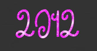
So I was just reading
this article on Yahoo news, and was wondering if any of you guys had heard of this, and what you think about it. Apparently if you turn your head sideways, cross your eyes and read the logo upside down, it spells Zion, so Iran is now going to boycott the 2012 Olympic games. All I can say is "Wut? Are these people serious?"
On a side note, I think we should boycott it on bad design. As much as it doesn't look like it says zion, it doesn't really look like 2012 either.
PostPosted: Mon Feb 28, 2011 5:57 pm
by Nate
While the claims of racism are ridiculously stupid, that is still a terrible logo.
PostPosted: Mon Feb 28, 2011 5:58 pm
by mechana2015
It's a terrible logo in the first place, but it just says 2012. I can't even see how you can bend it around to say zion in the first place without zigzagging all over the place.
PostPosted: Mon Feb 28, 2011 6:02 pm
by Furen
Wow, logo fail...
Canada's design was MUCH better! (then again, I'm biased)
Mech, if you read it from top to bottom then go right from there, it very vaguely represents it, I can see how people thought that.
PostPosted: Mon Feb 28, 2011 6:04 pm
by mechana2015
Furen (post: 1462487) wrote:Canada's design was MUCH better! (then again, I'm biased)
Actually just about ANY design is better than the London logo. That thing is pure eye searing graphic design failure on all levels.
PostPosted: Mon Feb 28, 2011 6:05 pm
by Warrior 4 Jesus
Oh, gosh. That logo is horrific. It's terrible. I hope they rethink the design.
PostPosted: Mon Feb 28, 2011 6:06 pm
by Radical Dreamer
A testament to bad design: I didn't even realize it was supposed to say "2012" until someone said something about that in this thread. XDD
PostPosted: Mon Feb 28, 2011 6:08 pm
by mechana2015
A font of combined comic sans and papyrus would be easier to read.
PostPosted: Mon Feb 28, 2011 6:11 pm
by Asuka Neko
mechana2015 (post: 1462493) wrote:A font of combined comic sans and papyrus would be easier to read.
I definitley made the worst "BLECH" face ever when I read that font description...
Who was the graphic designer behind that and what was going through their head!? Also, why are the Ohio State fans mad? Just because no Ohio sports teams can win anything does not mean we should go getting mad about stuff. Why would anyone put the name of an Ohio State player in the Olympic logo, anyway?
C'mon, our state is not that important.
PostPosted: Mon Feb 28, 2011 6:14 pm
by That Dude
I must agree. That is one 'hecka bad logo. Seriously.
PostPosted: Mon Feb 28, 2011 6:14 pm
by Furen
Radical Dreamer (post: 1462492) wrote:A testament to bad design: I didn't even realize it was supposed to say "2012" until someone said something about that in this thread. XDD
seconded
PostPosted: Mon Feb 28, 2011 6:15 pm
by sailorsaturn
I know this poor logo has already been beaten to death multiple times, but my honest thoughts when I first saw it were "Wow! What year is it? 1992?"
Anyways, back to the point, that logo isn't racist it just sucks.
PostPosted: Mon Feb 28, 2011 6:16 pm
by Dante
I AGREE WITH THE IRANIANS! IT DOES SPELL ZION! (Shh... maybe if people agree with it enough, they'll change that violation of our poor eyes)
PostPosted: Mon Feb 28, 2011 6:28 pm
by Radical Dreamer
mechana2015 (post: 1462493) wrote:A font of combined comic sans and papyrus would be easier to read.
[SIZE="6"][font="Papyrus"][color="Magenta"]You[/font][/color] [font="Curlz MT"][color="Yellow"]r[/font][font="Comic Sans MS"]ea[/font][font="Papyrus"]lly[/font][/color] [color="Magenta"][font="Comic Sans MS"]think[/font][/color] [font="Curlz MT"][color="Cyan"]so?[/color][/font][/SIZE]
Oh my gosh you guys I am forever sorry for this post. [font="Garamond"]Here's some Garamond to make it better.[/font] XD
PostPosted: Mon Feb 28, 2011 6:35 pm
by blkmage
Radical Dreamer (post: 1462508) wrote:[SIZE="6"][font="Papyrus"][color="Magenta"]You[/font][/color] [font="Curlz MT"][color="Yellow"]r[/font][font="Comic Sans MS"]ea[/font][font="Papyrus"]lly[/font][/color] [color="Magenta"][font="Comic Sans MS"]think[/font][/color] [font="Curlz MT"][color="Cyan"]so?[/color][/font][/SIZE]

PostPosted: Mon Feb 28, 2011 6:37 pm
by Yuki-Anne
Actually, it is easier to read. You are officially a better graphic designer than whoever did the London logo.
PostPosted: Mon Feb 28, 2011 6:38 pm
by Radical Dreamer
Yuki-Anne (post: 1462511) wrote:Actually, it is easier to read. You are officially a better graphic designer than whoever did the London logo.
Excuse me while I go cry intensely for DAYS. XDD I just wrote a small rant today about how Curlz MT is making my life so terrible. XDD
PostPosted: Mon Feb 28, 2011 6:38 pm
by Cognitive Gear
mechana2015 (post: 1462488) wrote:Actually just about ANY design is better than the London logo. That thing is pure eye searing graphic design failure on all levels.
I designed a better logo.
PostPosted: Mon Feb 28, 2011 6:39 pm
by ich1990
Radical Dreamer (post: 1462508) wrote:[SIZE="6"][font="Papyrus"][color="Magenta"]You[/font][/color] [font="Curlz MT"][color="Yellow"]r[/font][font="Comic Sans MS"]ea[/font][font="Papyrus"]lly[/font][/color] [color="Magenta"][font="Comic Sans MS"]think[/font][/color] [font="Curlz MT"][color="Cyan"]so?[/color][/font][/SIZE]
Oh my gosh you guys I am forever sorry for this post. [font="Garamond"]Here's some Garamond to make it better.[/font] XD
After seeing that Olympic logo, I am having a hard time finding this offensive. It just pales in comparison.
PostPosted: Mon Feb 28, 2011 6:44 pm
by Davidizer13
I saw this logo before: someone said it looked like a broken-up swastika. A pink one, too.
Also, the people who designed it apparently got $600,000 for it. Now that's offensive.
PostPosted: Mon Feb 28, 2011 6:53 pm
by Furen
Cognitive Gear (post: 1462514) wrote:I designed a better logo.
is that a one or a nine?
better than confusing 2012 with zion I guess!
PostPosted: Mon Feb 28, 2011 6:53 pm
by Yuki-Anne
Davidizer13 (post: 1462519) wrote:I saw this logo before: someone said it looked like a broken-up swastika. A pink one, too.
Also, the people who designed it apparently got $600,000 for it. Now that's offensive.
World hunger? What's that?
PostPosted: Mon Feb 28, 2011 6:58 pm
by Rusty Claymore
World hunger? What's that?
It's when we no longer throw people into Volcanos. XD
PostPosted: Mon Feb 28, 2011 7:00 pm
by Furen
Rusty Claymore (post: 1462525) wrote:It's when we no longer throw people into Volcanos. XD
Awww, darn... *crosses afternoon activities...*
PostPosted: Mon Feb 28, 2011 7:24 pm
by Dante
I don't know what I find more comical, the idea that they paid $600,000 for that logo or that they were thinking they could get away with only paying $600,000 for a logo for the Olympics. I mean, the event is going to be huge, you want to have the best advertising you possibly can. Otherwise, it just doesn't pay you to host it.
PostPosted: Mon Feb 28, 2011 7:28 pm
by Rusty Claymore
I looked at the logo and was all, "ZOR!!!"
PostPosted: Mon Feb 28, 2011 8:01 pm
by ShiroiHikari
I'm sorry Iran but you guys are silly for thinking this says "ZION". It's a terrible logo regardless, though.
PostPosted: Mon Feb 28, 2011 8:07 pm
by Shao Feng-Li
I hope they keep it just to spite Iran's retarded claim.
PostPosted: Mon Feb 28, 2011 8:14 pm
by Sapphire225
Had I not read the article, I never would have noticed that it looked like Zion (if barely). Still, I can barely see the 2012. Cognitive's 2012 was much clearly...despite that 1 looking like a 9.
PostPosted: Tue Mar 01, 2011 2:05 am
by CrystalChalice
That was supposed to say 2012? It looked like random puzzle pieces to me.